Fintech Finance Dashboard
A self-initiated project built as part of a hiring assignment. Designed a data-dense finance dashboard in React + TypeScript — focused on information hierarchy, data visualisation with Recharts, and making numbers readable at a glance for a non-finance user.
View live✦ The Brief
Where it started
I set out to build something that looked like it belonged inside a real fintech product — not a tutorial. The brief I gave myself was sharp: a dashboard that lets a non-finance person look at their numbers and instantly understand what's going on. No jargon. No decorative charts. No scrolling forever to find the one KPI they actually care about. If a small business owner can read it in three seconds, it works. If a developer can read the source and immediately see the structure, it works twice.
✦ The Thinking
Decisions before code
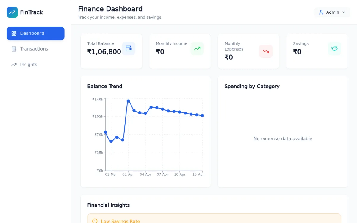
Before I opened the editor, I sat with a single question: what does the user need to see in the first three seconds? I sketched a hierarchy where headline KPIs live at the top, the trend story sits in the middle, and granular transactions stay one tap away. I picked a calm, slightly cool palette so the data could be the loudest thing on the screen. Spacing was deliberate — generous whitespace between cards so each metric gets room to breathe instead of competing for attention. I wanted the dashboard to feel like a calm operations room, not a casino floor.
✦ Building it
From sketch to ship
React with TypeScript for type safety on the data shapes. Tailwind for fast iteration on layout. Recharts for visualisations because it composes cleanly with React patterns. The trickiest part was making the charts feel coherent — different chart types share the same colour language and tooltip styling, so the eye never has to relearn the visual rules as it moves down the page. I also spent real time on responsive behaviour: the grid collapses gracefully and the charts re-aspect themselves rather than just shrinking awkwardly on mobile.
Stack
Screenshots
✦ What I'm proud of
The detail that mattered
The information hierarchy. Every card and chart is sized to its decision-making weight, not just placed for symmetry. The most important number is the biggest. The least important is a quiet footnote. That sounds obvious, but most dashboards I've audited break this rule constantly — they treat every metric as equally loud and end up saying nothing.
✦ What I'd do differently
The honest reflection
I'd add a state-management layer like Zustand or React Query from day one, even though the current app uses local data. It would make the next step — wiring this to a real API — much smoother. I'd also add a light/dark toggle; some finance users live in dark mode and the current single-theme design assumes everyone wants the same surface.